PayPal Console Design System
Year: 2019-2023

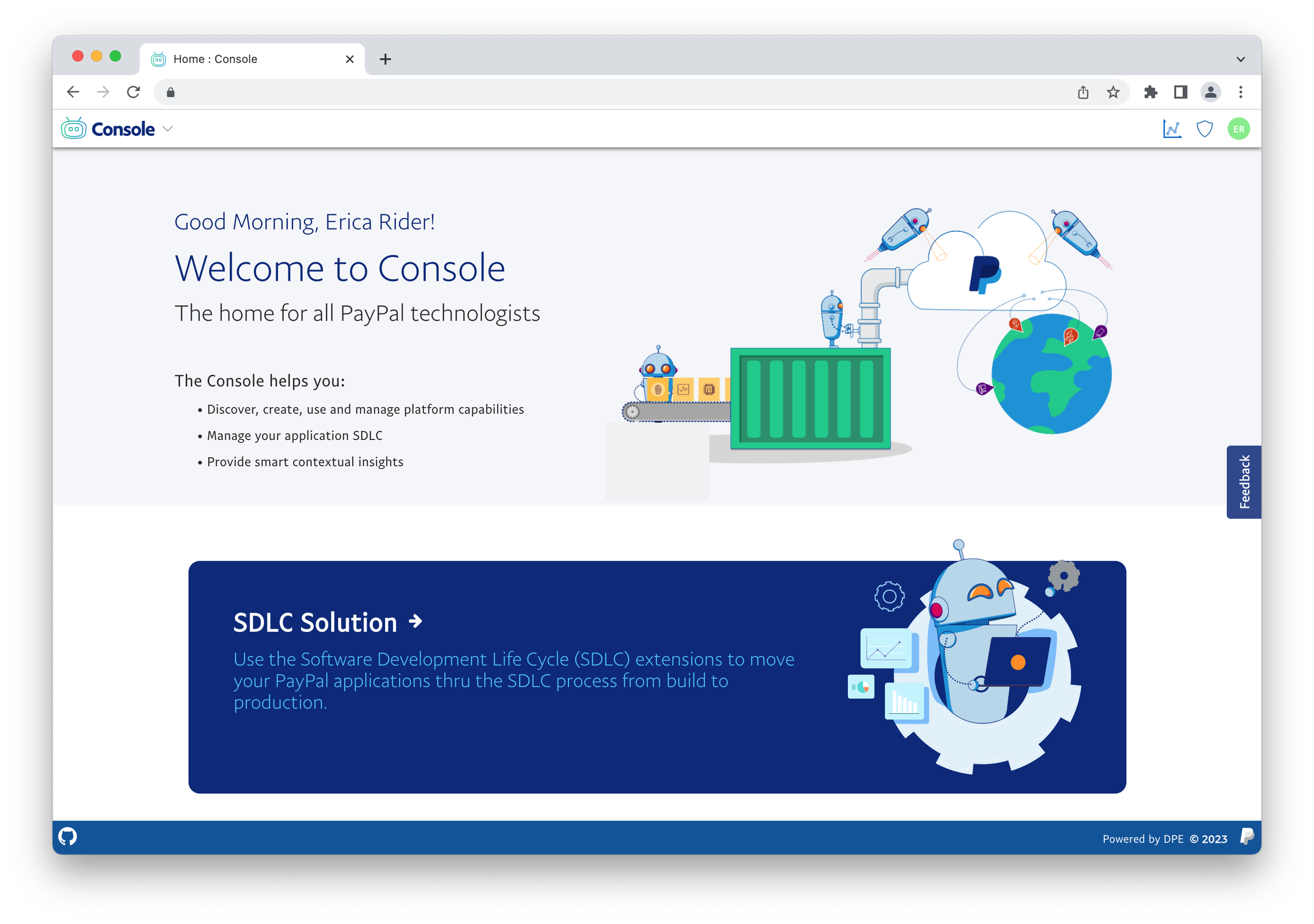
The PayPal Console is a central platform for software and data development at PayPal. It provides a frictionless, self-service experience, enabling developers to accomplish their tasks faster with full visibility into the applications they are building.
Goals
Deliver a cohesive and consistent platform experience to internal PayPal developers that feels like a PayPal product.
Build trust and establish a connection with the internal PayPal developer community.
My Role
In the beginning my role was to be the primary designer responsible for all of the design decisions from the initial character design to setting the path for designing an enterprise ready version of the PayPal UI to development of the Console bots. As time went on and my team grew my roll evolved to leading the team to expand on my initial vision and design direction.
Console UI
Prior to the console the org had 60-100 different products all built with different UI libraries. No two products looked the same and none of them looked like they belonged to PayPal. From a UX perspective a main goal was to unite all of the internal products under a single UI platform That was enterprise ready and looked like the PayPal UI design platform. Having a very small design team with little to no engineering support developing a design system and UI component library from scratch was out of the question, this would have taken a much larger team and would have been cost prohibitive to support in the long run. With these factors in mind we set out to find an existing UI library that we could use as a foundation for our Console UI.
Exploring Component library options
We started out evaluating several different systems such as Clarity by VMware and Material
Clarity and Material
Clarity by VMware was our first option it was enterprise ready and followed the page architecture I was looking for to support our needs for the console. The pro is it had many components we needed and it was enterprise ready out of the box. The deal breaker for clarity was that we could not easily skin or customize it to use our PayPal colors or make objects such as buttons consistent with PayPal buttons. Making these changes would make it difficult pick up updates as the base Clarity library evolved.
Material was easier to do the customizations we needed. The downside is that it always looked like Material with PayPal colors and did not ever really look like a PayPal property. The primary downside to material was the level of work needed to create the different components we needed for the console platform. The process was extremely slow with the limited developers we had available to us.
Console Fluent
We settled on using Fluent from Microsoft. Fluent out of the box had a good set of components out of the box that we could use right away and it was easy for us to combine existing components and create new ones that specifically met our needs.
Console UI vs PPUI
When we started in 2019 the consumer facing design team was just starting to look at creating a centralized react library for PayPal products. The two major downsides to the PPUI for the console was the limited components available and PPUI was designed for customer facing products and mobile. Being mobile ready / touch friendly resulted in information being spread out more and controls such as buttons being much larger. The console needed to utilize space much more efficiently, controls such as buttons needed to be smaller. We also needed components such as dat tables that were optimized to cleanly show a lot of data. This was not part of the plan for PayPal UI.
We did utilize PayPal UI tokens so that we could make colors, corner radiuses on buttons and other elements consistent with the rest of the PayPal design system.
Utilizing our methods we were able to create an enterprise ready UI framework for our internal tools that closely aligned with the rest of the PayPal products.
Console Identity
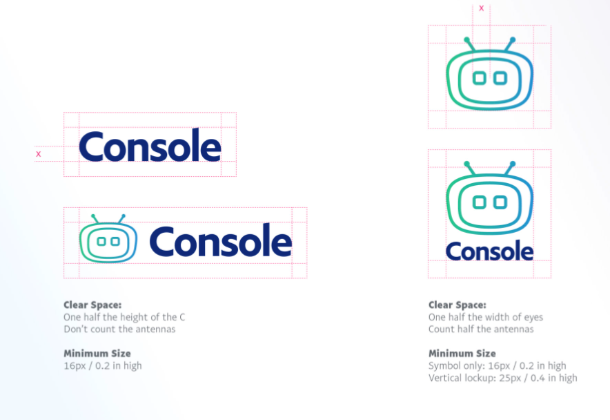
Console Logo
A small team makes it difficult to cover all of the bases internally. To help us with the console branding I brought in an external design firm. I worked with the external firm to set the perimeters outlining the project as well as facilitating research to help us decide on the direction and final console logo.
Take a look at the design spec for the console identity
Extension category Icons
As part of the console identity our external design firm we contracted created a series of icons to represent the different categories of extensions that can be delivered to customers in the console platform.
AI / ML
Tools for understanding user behavior and driving how products respond and interact with end users.
Analytics
Extensions for monitoring the platforms used to run

Developer tools
Most of the tools used in the software development lifecycle
Infraservices
Tools for managing infrastructure such as container management.
Iconography
Paypal has an extensive set of icons, the down side for us was they are aimed at consumer facing use cases. We could utilize some of the icons but many of the icons in the core set do not work for internal developer tools and platforms. Over time we added over 100 additional icons to the existing set of PayPal Icons that looked like they belonged with the core icons but expressed concepts such as deploy, containers, applications, and so on.
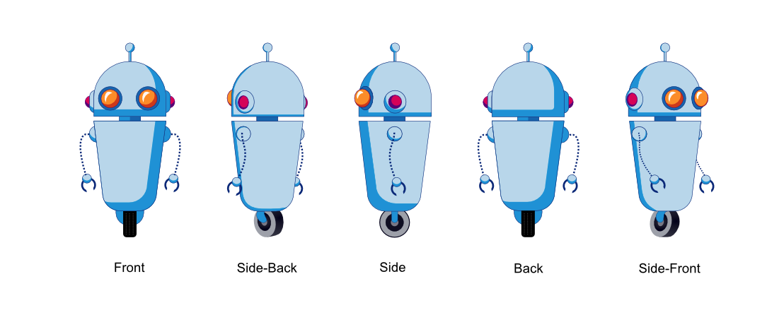
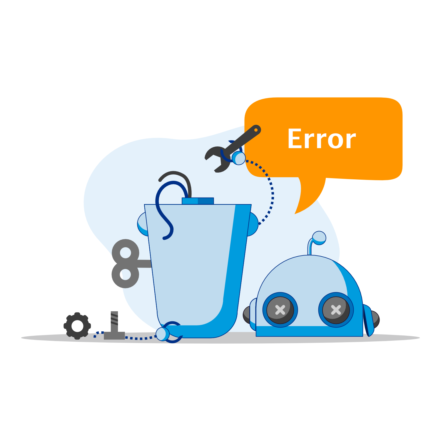
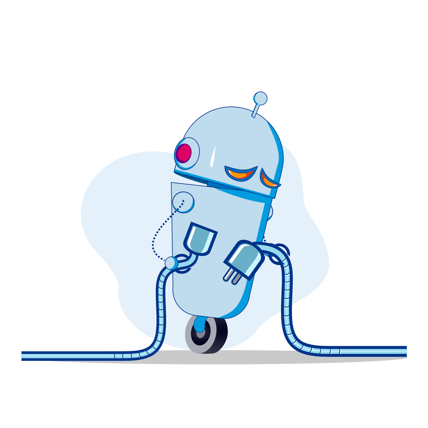
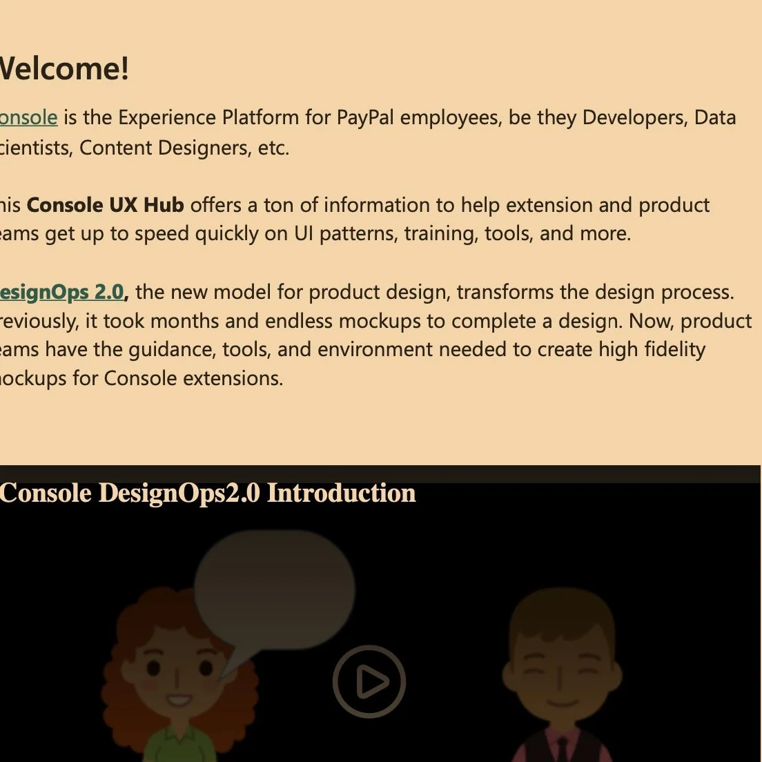
Console bots
The organization responsible for the console in PayPal has had a serious image problem with in the company. To change the image the company had with the organization a lot of changes had to me made. One was finding a way to give them something to connect with. I initially designed the console robots to use on the console to give the console a personality. Once the team grew I passed the bots to one of my team members who expanded them and gave them more personality. The bots quickly resonated with people and we expanded the use of them over time.
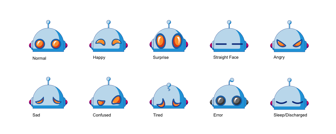
Bots for Messaging
The initial use case for the bots was to use them in the messaging for the console. Platform messages are ones that users often just click to dismiss them without reading important information. To help slow users down and to give them something visual they can identify with a specific message we created different versions of the bots to illustrate the common messages that users see in the platform.
Over time we found that users liked the robots in the messaging and they stopped to look and read messaging rather than moving on from the message then contacting support because they missed the information displayed
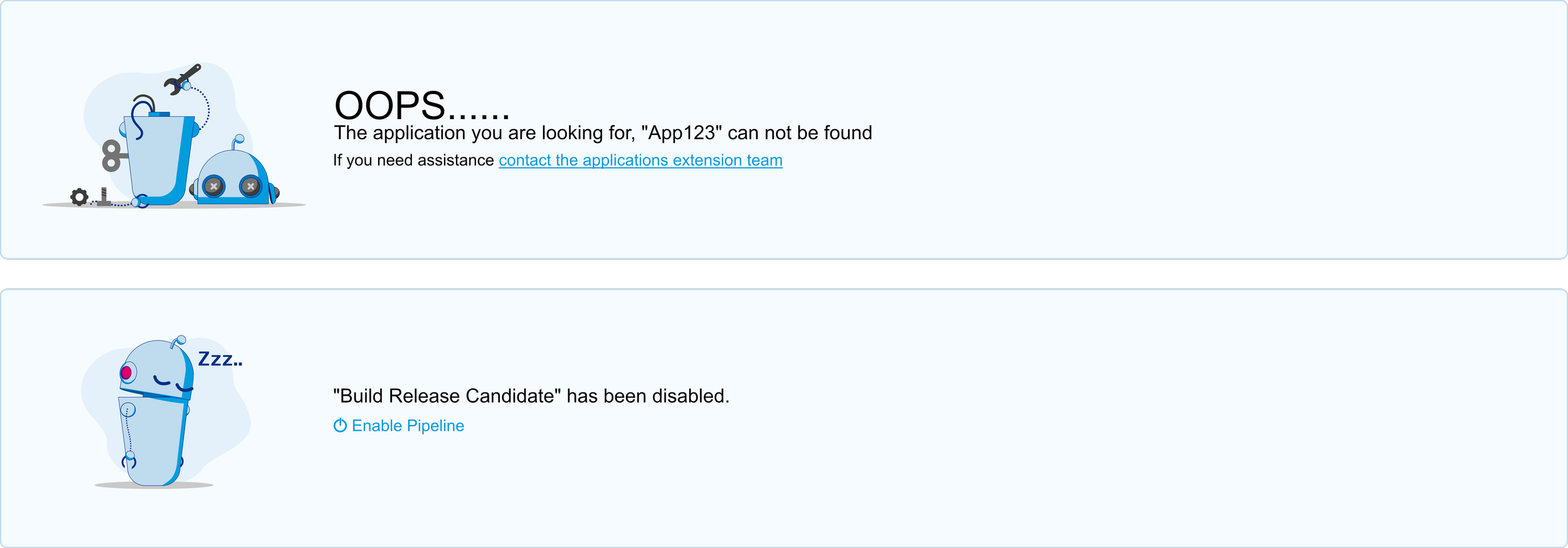
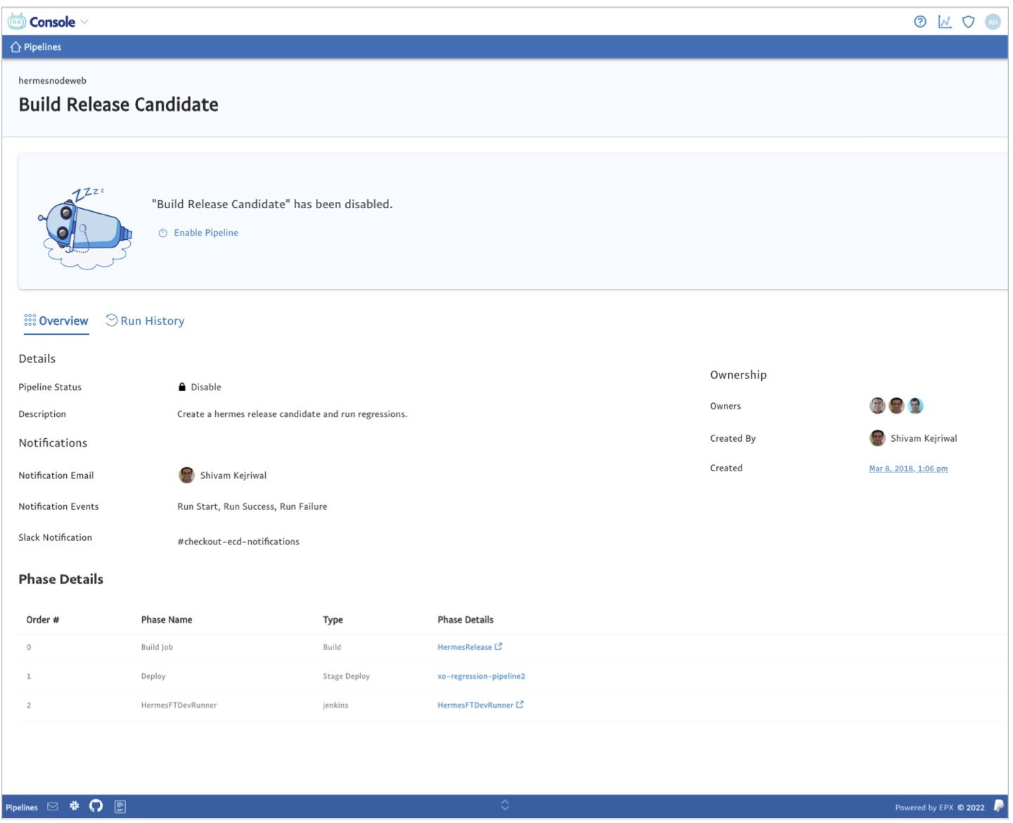
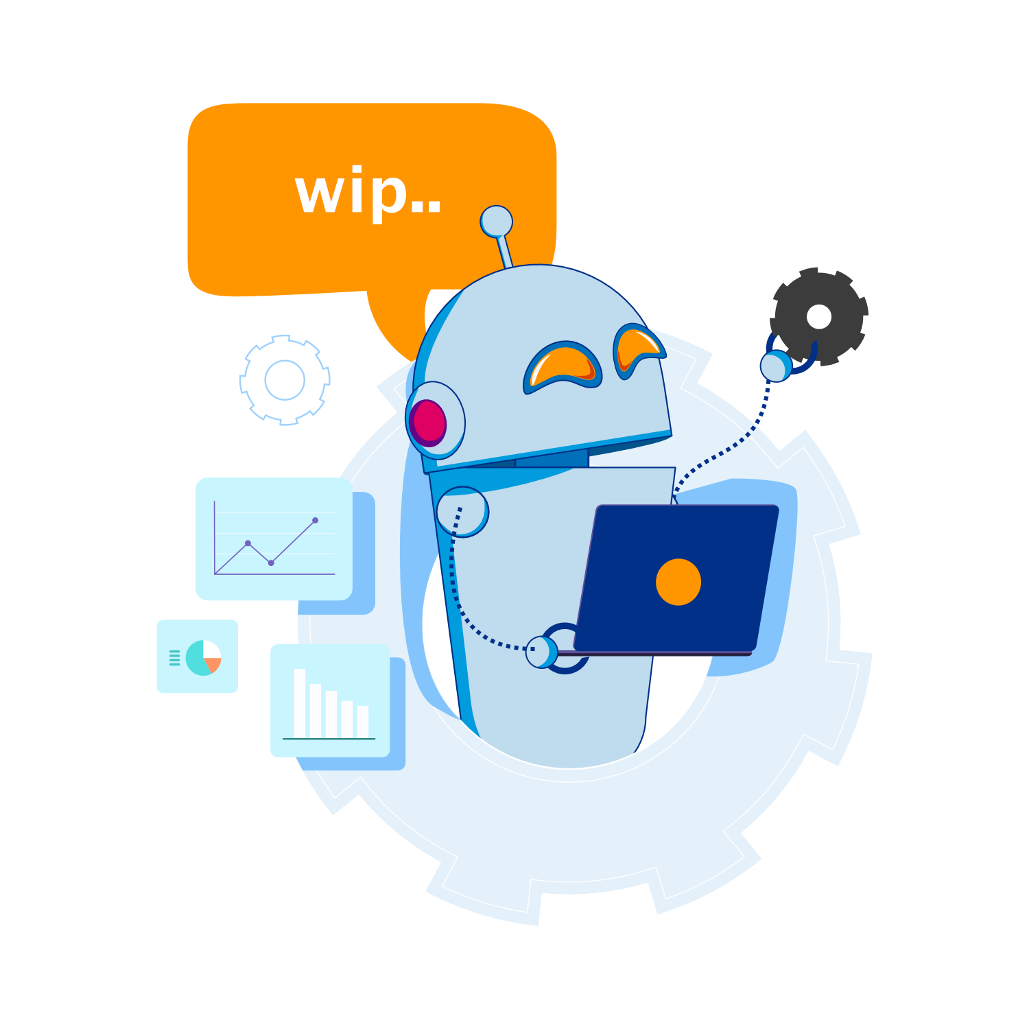


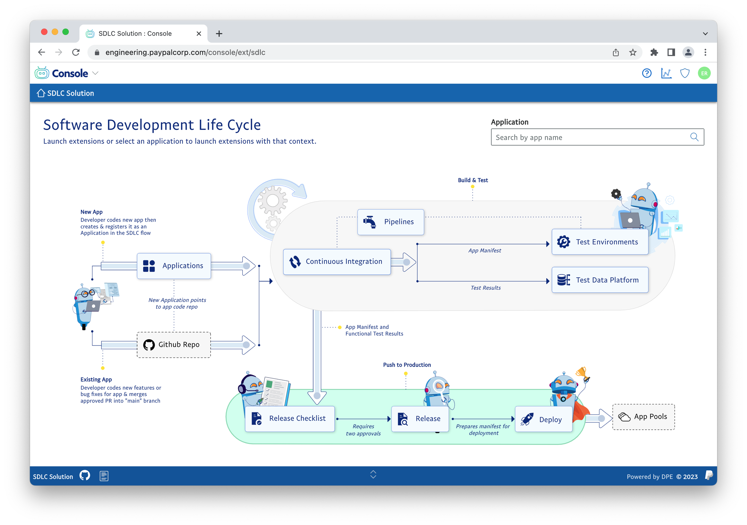
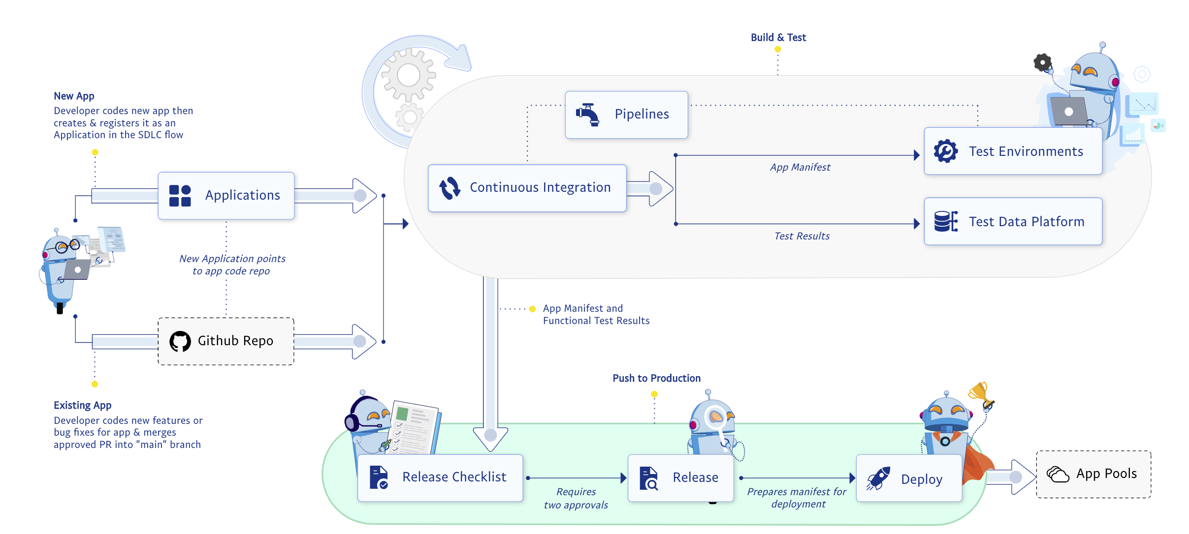
Bots in Diagrams
Delivering Design at Scale
Consistency and cohesiveness is key to a great user experience. This is often done with traditional guidelines and patterns. We had a different approach to delivering the consistency. We started out with the traditional methods of creating design patterns we quickly found that we would not be able to scale or maintain consistency with traditional methods. We had an extremely small design team, using traditional methods of design patterns and guidelines would require my team to work around the clock writing documentation and informing the design patterns. This made us find ways to solve our design at scale problem with innovative solutions.
Building UX into Platform and UI components
A key component to delivering a consistent cohesive user experience at scale was to make it easier to build products that followed our design patterns than to deviate from them. Components could be customized but out of the box they always worked they way we wanted them to promote consistency.
Unified Prototyping and Production Components
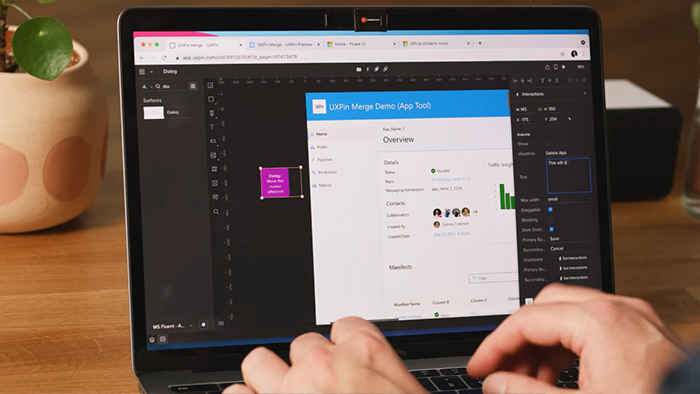
We utilized Merge from UXPin to enable us to use the react components from our production UI framework for prototyping. This enabled designers and product teams to duo rapid high fidelity prototypes.
Details on our successes with UXPin can be seen here
Enabling Product Teams
In order to scale design the UX team had to enable product teams to do the basic design in a self service model. A big part of this was for the team to provide an environment that product teams could thrive and be successful. We had 3 main components for supporting teams.
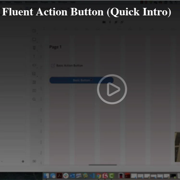
Training Videos
To help product teams create prototypes of their products with our design system the UX team created our own video learning system with over 4 hours of training videos.
Office Hours
The UX team delivered a tool that enabled customers to pick a service they needed design help with and a time slot. The tool would set up time on a designers calendar and set up a meeting automatically. This allowed us to significantly increase the teams we supported.
Articles
Along with the training videos the UX team created a series of articles that help product teams learn to make good choices for the users.